
Here’s a reality check for Indian businesses: over 80% of Google searches in India happen on mobile devices.
Not desktop. Not tablet. Mobile – on mid-range Android phones, over 4G connections, often while commuting, waiting, or shopping between tasks.
And yet, a significant number of Indian business websites are still built primarily for desktop. The mobile version is an afterthought – squeezed onto a small screen, with tiny text, slow load times, and navigation that requires zooming.
Google noticed. In 2020, Google switched to mobile-first indexing for all websites. That means the mobile version of your site is what Google primarily crawls and ranks – not the desktop version. If your mobile experience is poor, your rankings suffer regardless of how polished your desktop site looks.
This is your complete mobile SEO 2026 guide – what mobile-first indexing actually means, what Google checks, and the specific changes that produce real ranking improvements.
What Mobile-First Indexing Actually Means
Mobile-first indexing doesn’t mean Google only indexes mobile pages. It means Google uses the mobile version of your site as the primary version for indexing and ranking decisions.
If your mobile site has less content than your desktop site – fewer headings, shorter text, missing images – Google’s index reflects the mobile version. That thinner content is what gets ranked, not the richer desktop version your SEO team worked on.
The practical implication: your mobile and desktop sites need content parity. Everything on your desktop version that matters for SEO – key headings, body content, structured data, internal links – must also be present and accessible on mobile.
Common Mobile-First Indexing Problems
- Hidden content on mobile – text collapsed behind “Read More” toggles or tabs that Google may not crawl deeply
- Different URLs for mobile (m. subdomains) – requires careful canonical implementation to avoid splitting ranking signals
- Images that don’t load on mobile – if your mobile CSS hides images that desktop shows, Google’s mobile crawl misses them
- Structured data only on desktop – schema markup needs to be on both versions
Section 1: Mobile Usability Fundamentals
Before technical optimisation, get the basics right. Google’s Mobile-Friendly Test (available free at search.google.com/test/mobile-friendly) is your first diagnostic step – run every important page through it.
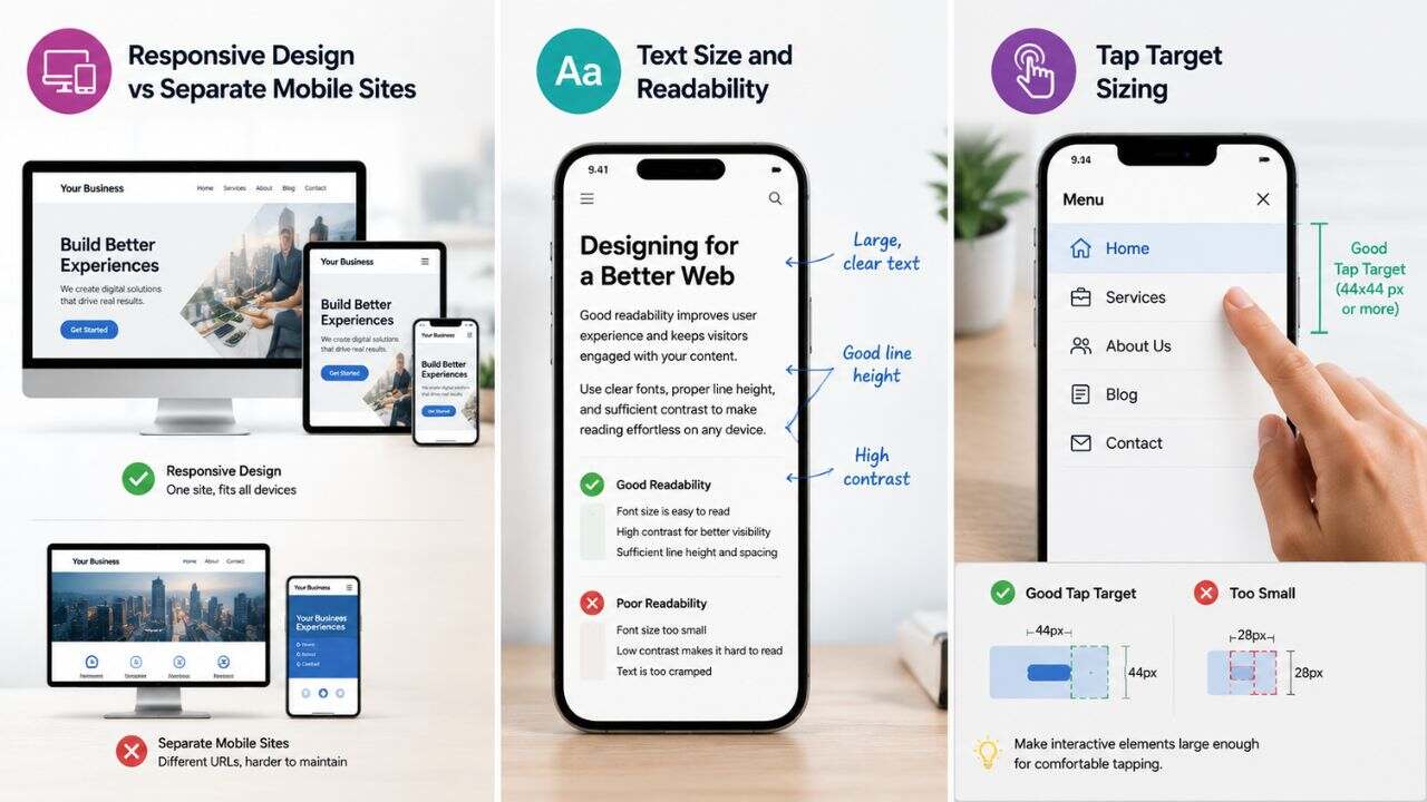
Responsive Design vs Separate Mobile Sites
Responsive design is the correct approach in 2026. A responsive site uses a single URL and adapts layout based on screen size via CSS. It eliminates content parity problems, simplifies canonical management, and is the implementation Google explicitly recommends.
Separate m. subdomain sites can still work but require rigorous maintenance to keep content in sync across versions. Most businesses that have them would be better served migrating to responsive design.
Text Size and Readability
Body text should be a minimum of 16px on mobile. This sounds simple but it’s consistently violated on Indian business websites – especially on WordPress themes with default font sizes of 13–14px.
Small text forces users to pinch and zoom, increases bounce rate, and signals poor mobile experience to Google’s evaluation systems. Set your base font size in CSS and test it on an actual mid-range phone, not just your browser’s device emulator.
Tap Target Sizing
Every clickable element – buttons, links, navigation items, CTAs – should have a minimum touch area of 48px × 48px with adequate spacing between targets.
Tightly clustered links are one of the most common mobile usability errors Google flags in Search Console. When links are close together, users tap the wrong one, triggering immediate back-navigation – a negative engagement signal.
Section 2: Mobile Page Speed
Mobile page speed and mobile SEO are inseparable. A page that loads in 4–5 seconds on mobile loses a significant portion of visitors before they’ve seen a single word of your content.
Why Mobile Speed Is Harder
Mobile pages face constraints desktop doesn’t:
- Slower processors on mid-range phones mean JavaScript takes longer to execute
- Variable network conditions – 4G in India ranges from near-broadband in metros to significantly slower in Tier 2/3 cities
- Higher latency on mobile networks compared to fixed broadband
This means optimisations that produce marginal gains on desktop can produce dramatic improvements on mobile.
The Three Mobile Speed Priorities
- Image optimisation above everything else. Images are the dominant cause of slow mobile load times. Every image should be compressed, served in WebP format, and sized appropriately for mobile screens. A 1920px wide image served to a 390px wide phone is waste – use responsive images with srcset to serve appropriately sized versions.
- Eliminate render-blocking resources. Scripts and stylesheets that load before your content block mobile rendering – which is already slower due to device constraints. Defer non-critical JavaScript, inline critical CSS, and remove unused CSS from the above-the-fold rendering path.
- Reduce total page weight. Mobile users on limited data plans and variable connections suffer disproportionately from heavy pages. Target a total page weight under 1MB for key landing pages. Most Indian business homepages are 3–8MB – primarily from unoptimised images.
Section 3: Mobile Content and UX
Content Hierarchy for Small Screens
On mobile, the most important content must come first. Unlike desktop where users have a wide viewport and can scan in an F-pattern across the page, mobile users scroll vertically. If your value proposition, primary CTA, or key information is buried below multiple hero sections and animated banners, mobile users won’t reach it.
Restructure your mobile content hierarchy:
- Lead with your most important message in the first 200 pixels
- Place your primary CTA above the fold on mobile
- Use short paragraphs – 2–3 sentences maximum – for mobile body content
- Break up long sections with subheadings that function as visual anchors while scrolling
Navigation for Mobile
Hamburger menus are standard but often poorly implemented. The issues:
- Menu items too small to tap accurately
- Too many levels of nested navigation
- No breadcrumbs to help users understand where they are
- No sticky header, meaning users have to scroll back to the top to navigate
For Indian business websites, a bottom navigation bar for the 3–5 most important links often outperforms a hamburger menu for usability – it mirrors how popular Indian apps (Swiggy, Zepto, Zomato) handle navigation, which means users already know the pattern.
Mobile Forms and Lead Capture
If your business generates leads through contact forms, your form must be optimised for mobile input.
Common failures:
- No autocomplete attributes – forcing users to re-type information their phone already knows
- No inputmode attributes – showing a full keyboard for a phone number field instead of the numeric keypad
- Too many required fields – on mobile, every additional field increases drop-off significantly
- No visible error states – submitting a form with an error and getting no clear feedback is a common mobile UX failure
For Indian businesses, WhatsApp click-to-chat buttons often outperform contact forms for mobile lead generation – they remove form friction entirely and connect users to a channel they’re already comfortable with.
Section 4: Mobile SEO Tips 2026 – Technical Checklist
Run through this technical checklist for every important page:
Structured Data on Mobile
Schema markup must be present on your mobile pages. Many WordPress sites implement structured data via plugins that conditionally load schema – verify your mobile pages include LocalBusiness, FAQPage, and Article schema using Google’s Rich Results Test on mobile URLs.
Viewport Meta Tag
Every page must include the correct viewport meta tag: <meta name=”viewport” content=”width=device-width, initial-scale=1″>
Missing or incorrect viewport tags cause pages to render at desktop width on mobile, triggering horizontal scrolling and immediate bounce.
Avoid Intrusive Interstitials
Google penalises pages with intrusive interstitials on mobile – full-screen popups, overlays, or banners that block content when users arrive from search.
Permitted: small banners, age verification, login walls for paywalled content. Not permitted: full-screen newsletter popups, cookie consent modals that cover the full screen, promotional overlays triggered on page load.
Canonical Tags
If you have both desktop and mobile URLs, canonical tags must be correctly implemented on both versions – desktop pages should canonicalise to themselves, and mobile pages (m.) should canonicalise to the desktop version. Incorrect implementation splits ranking signals between versions.
Section 5: Smartphone Search Optimization for Indian Audiences
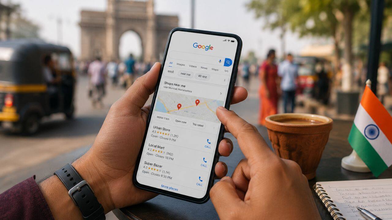
India has specific mobile search characteristics that affect optimisation strategy:
Voice search is significantly more common in India than in Western markets, driven by multilingual users who find typing in English inconvenient. Optimising for conversational, question-format queries – especially in local SEO – captures voice traffic that pure keyword-based content misses.
Regional language searches are growing rapidly. If your business serves Hindi, Tamil, Telugu, Bengali, or other regional language speakers, consider whether your mobile content addresses them in their preferred language or search query format.
WhatsApp as a discovery channel – many Indian users discover businesses through WhatsApp shares and links, then visit the mobile site directly. Your mobile landing experience needs to convert these warm referral visitors as effectively as search traffic.
The Bottom Line
Mobile SEO in 2026 isn’t a separate track from SEO – it is SEO. Google’s mobile-first index means your mobile experience determines your rankings, your visibility in AI Overviews, and your ability to compete in an increasingly mobile-dominant Indian search landscape.
Start with Google Search Console → Mobile Usability to identify flagged issues. Fix tap targets and font sizes. Compress your images. Test your forms on a real mid-range Android phone.
The businesses winning in Indian organic search in 2026 are the ones that treat mobile as primary – not an afterthought.
Want BeSky Marketing to Audit Your Mobile SEO?
Frequently Asked Questions (FAQs)
Q1. What is mobile-first indexing and does it affect my website?
Mobile-first indexing means Google ranks your site based on its mobile version. If your mobile website is slow or missing content, rankings can suffer.
Q2. How do I check if my website is mobile-friendly?
Use Google Mobile-Friendly Test, Search Console, and PageSpeed Insights. Also test your site on a real mobile device for the best experience check.
Q3. Does mobile page speed affect SEO rankings?
Yes, mobile speed directly impacts SEO through Core Web Vitals. Faster mobile websites rank better and improve user experience.
Q4. What is the difference between responsive design and a separate mobile site?
Responsive design uses one website for all devices, while separate mobile sites use different URLs. Google prefers responsive websites for better SEO.
Q5. How important is mobile SEO for local Indian businesses?
Mobile SEO is essential for local businesses in India because most local and “near me” searches happen on smartphones, driving calls and visits.
